Coopers Book of Original
Coopers Brewery
To save Coopers from becoming irrelevant to Aussie drinkers (who were experimenting with a whole new raft of craft beers), we went back to the most important element of the brand – the beer.
Our response: a new brand platform, ‘Forever Original’, rolled across branding design, brand voice and customer experience – highlighting Coopers’ origins as Australia’s original craft beer and communicating the brand’s relentless pursuit of never settling.
Rekindling an Australian icon is one thing, but making sure the people behind the brand are aligned and united is arguably even more important.
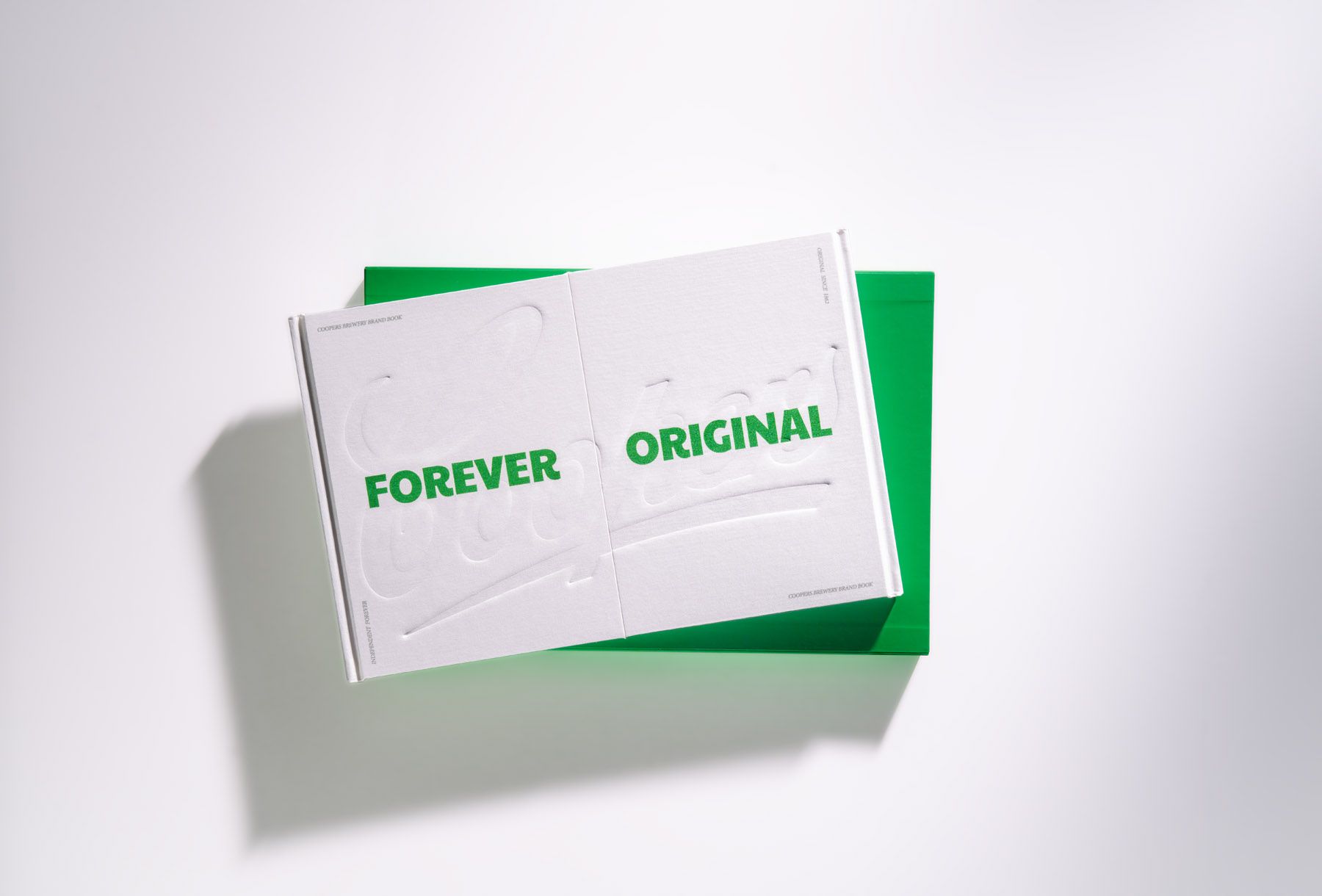
So we created the Coopers 'Book of Original'.
Doing things by the book
Our brief from Coopers was to develop a brand book to hero and bring to life the brand for a sales event, as well as internal brand building, new employee induction and engagement.
However, it was our intention to create a book that wasn’t just a brand book or style guide, it was a true encapsulation of the business, brand and family in a tangible format that Coopers staff could engage with physically - touch, feel, weight, size were all considerations.
The book needed to be as crafted as the beer itself.
The purpose of the book was to inspire and help keep Coopers employees aligned with the purpose and core idea of the organisation - helping them think, communicate and act from that purpose, ensuring all discussions they had with each other, with customers and drinkers were consistent.
Execution
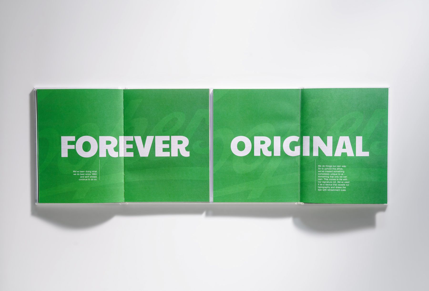
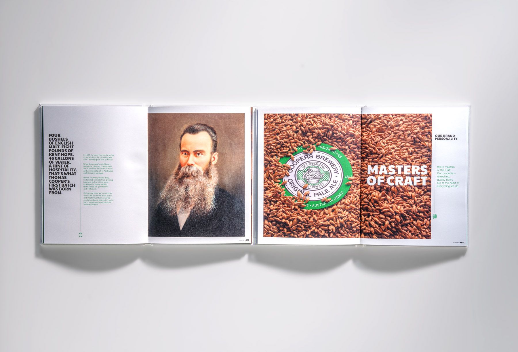
Reinforcing the Forever Original brand idea, we split the Book of Original in two – folding opposite ways and meeting perfectly in the middle. A printing method never attempted before. This was designed to help us tell both sides of the brand story and pay homage to both sides of the Coopers family.
FOREVER: One side focused on the 160-year independent history of the brewery.
ORIGINAL: The attitude and approach to brewing beer on the other side.
When combined, these two sides create a brand idea that’s fiercely independent and will never succumb to fads or trends. Coopers is a brand that rolls its own way.
We landed on a considered layout design, with confident use of space and dynamic photography and crops, in keeping with the new drinker communications we created for the brand in OOH, print, POS, VM and TV.
The Book of Original’s scale was made to be identical to the specs of a 6-pack (3x2 cans stacked) of Coopers Pale Ale (the green one) in size and weight - approximately 2.42kg.
As part of the project, we developed the brand experience, a language guide and how this was to be applied and achieved across various channels.
Coopers employees could refer to the Book of Original for clear messaging on what the brand stands for: look, feel and experience across packaging, photography, illustration style and more; tone of voice; a summary of our comms approach and how everything must ladder up to Forever Original; as well as a channel summary outlining how Coopers behaves in different channels.
The Coopers Book of Original recently won a GOLD award at the recent Australian Print Awards.
It’s incredibly exciting how the entire Coopers community has embraced a single idea for the brand - for the first time in over 160 years. ‘Forever Original’ isn’t just an advertising line, but a mantra for every aspect of our business and the brewing process. The Book of Original has been instrumental in bringing this idea to life and encouraging the team to talk about it in the market with partners, customers and drinkers.
Kate Dowd National Marketing Director, Coopers Brewery.


More Work